As an Amazon Associate I earn from qualifying purchases.
Having an equity curve graph is a great way of visualizing your gain/loss over time. It helps you to identify if your strategy is too choppy and not a consistent upward curve. Let’s have a look at how we can create an equity curve chart with Python and MT5. As mentioned in Plot a candlestick chart for stocks, forex, or crypto in Python, I will be using Plotly. If you haven’t done so already, you will need to install Plotly for this tutorial.
Install Plotly
To get Plotly running on Python, you will need to get the library which can be downloaded using pip install with the following command:
pip install plotlyImport the library into your algorithmic trading bot:
import plotly.graph_objects as goGenerating the equity curve
Now that you have imported Plotly, create a new method named gen_equity_curve with no arguments.
def gen_equity_curve():Next, define a date_from. You will want to set a date that is older than your account (so that you capture all the trade data):
def gen_equity_curve():
    date_from = datetime.datetime(2020,1,1)
Define a variable named date_to and assign it to the current date-time, adjusted for your broker timezone. If you want more information on this, please see this article:
def gen_equity_curve():
    date_from = datetime.datetime(2020,1,1)
    date_to = datetime.now().astimezone(pytz.timezone('Europe/Athens'))
    date_to = datetime(date_to.year, date_to.month, date_to.day, hour=date_to.hour, minute=date_to.minute)
Let’s get every single trade ever made on your account. This can be achieved with the get_order_history function we created earlier:
def gen_equity_curve():
    date_from = datetime.datetime(2020,1,1)
    date_to = datetime.now().astimezone(pytz.timezone('Europe/Athens'))
    date_to = datetime(date_to.year, date_to.month, date_to.day, hour=date_to.hour, minute=date_to.minute)
    deals = get_order_history(date_from, date_to)
Now that you have a data frame with all your trades from the beginning of your account, make sure they are sorted by date-time:
deals = deals.sort_values(by='time')You will need a cumulative sum of your profit/losses for each trade. The cumsum() method will allow you to calculate the total sum of profit as the data grows. Create a new column in the deals data frame and run the cumsum() function on the profit field:
deals['runningTotal'] = deals['profit'].cumsum()And finally, since we are only interested in the time and runningTotal fields, create a subset of this data and return the deals data frame:
    deals = deals[['time', 'runningTotal']]
    return deals
Creating the equity curve graph
The only thing left to do now, is create the equity curve graph. Create a new method with no arguments and name it print_equity_curve:
def print_equity_curve():Get the equity curve data by calling gen_equity_curve() (created in the last section) and assign it to a variable name equity_chart_data:
def print_equity_curve():
    equity_curve_data = gen_equity_curve()
For simplicity, go ahead and extract time from the equity_curve_data data frame and assign it to x_axis. Similarly, extract runningTotal from equity_curve_gen and assign it to y_axis:
def print_equity_curve():
    equity_curve_data = gen_equity_curve()
    x_axis = equity_curve_data['time']
    y_axis = equity_curve_data['runningTotal']
To plot the equity curve you will be using a go.Scatter object. Define this object, specifying x and y and assign it to a variable named chart_data:
def print_equity_curve():
    equity_curve_data = gen_equity_curve()
    x_axis = equity_curve_data['time']
    y_axis = equity_curve_data['runningTotal']
    chart_data = go.Scatter(x=x_axis, y=y_axis)
Create a go.Figure object, assigning the data field to the chart_data variable you just created:
def print_equity_curve():
    equity_curve_data = gen_equity_curve()
    x_axis = equity_curve_data['time']
    y_axis = equity_curve_data['runningTotal']
    chart_data = go.Scatter(x=x_axis, y=y_axis)
    fig = go.Figure(data=chart_data)
Finally, add fig.show() to generate and print the chart:
def print_equity_curve():
    equity_curve_data = gen_equity_curve()
    x_axis = equity_curve_data['time']
    y_axis = equity_curve_data['runningTotal']
    chart_data = go.Scatter(x=x_axis, y=y_axis)
    fig = go.Figure(data=chart_data)
    fig.show()
Testing the code
To test this, I will be calling the connect() method and then print_equity_curve().
connect(3442423432)
print_equity_curve()

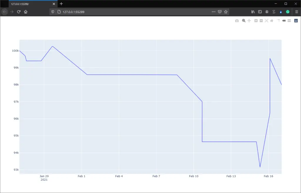
As you can see, my equity chart for my demo account has been displayed on my browser.
If you’re interested in learning Python I highly recommend this book. In the first half of the book, you”ll learn basic programming concepts, such as variables, lists, classes, and loops, and practice writing clean code with exercises for each topic. In the second half, you’ll put your new knowledge into practice with three substantial projects: Space Invaders-inspired arcade game, a set of data visualizations with Python’s handy libraries, and a simple web app you can deploy online. Get it here.
That’s all for Create an equity curve chart with Python and MT5! Check back on Monday to see how you can plot a candlestick graph with moving averages! As always, if you have any questions or comments please feel free to post them below. Additionally, if you run into any issues please let me know.


